Written by
Golem Radio
on
on
Some graphs about inequality
I got interested in what folks were saying about income inequality in the U.S., and found some interesting stuff.
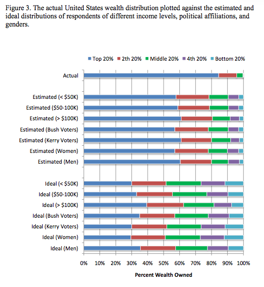
First of all, an economist named Dan Ariely has found that no one perceives income inequality accurately. The following graph (from the post link), shows how much of the total income in the US is controlled by each quintile of earners. The width of the color band represents the proportion. So the top band is how it really is and the subsequent bands are how the different groups designated perceive it. Have a look:

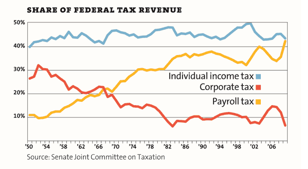
On another note, Mother Jones has done a 11 different charts illustrating what inequality really looks like here. This one, showing trends in Federal Revenue, really irks me:
